


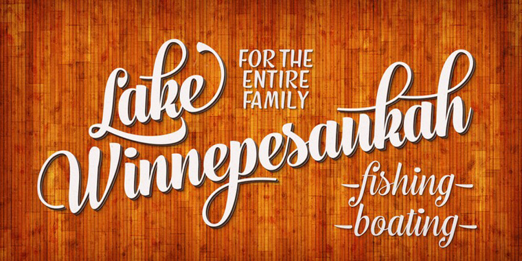
A Typographic Anatomy Lesson

Do you know what all the parts of the characters in an alphabet are called? To be honest, although I examine, discuss and write about type on an almost daily basis there still are blind spots in my typographic vocabulary. Sometimes I can be really struggling to name very specific details. This is where the limited edition Lesson Plan Print comes to the rescue. Ligature, Loop & Stem have produced a great print with an overview of all you need to know about typographic anatomy.


From the Ligature, Loop & Stem website:
Think you know your typographic anatomy? Can you tell a dot from a tittle or an aperture from an ascender at seventy-two points?
Typographers refer to elements of a letterform using a variety of terms that align naturally to architecture or the human body – eye, ear, foot, arm, lobe, leg – and we've captured many of them in this modernist-style limited edition print.


Each individually numbered 12″ × 16″ print is reproduced in Toronto by Neil Wismayer at TypeCon2010 "Babel" by designers Scott Boms and Grant Hutchinson. They are looking at possibilities to sign a larger portion prior to shipping, but with Scott residing in Toronto and Grant in Calgary, they can't guarantee anything.
Prints ship in heavy-duty stay-flat sleeves with additional acid-free cardboard inserts and protective corners for added protection. Prints are not matted or framed.


I asked Grant to tell me more about Ligature, Loop & Stem, self-proclaimed "creators and curators of fine typography-related products."
G R A N T H U T C H I N S O N| "It's simple really. We – designers Scott Boms, Luke Dorny, and Grant Hutchinson – love all things typographic. Keeping this in mind, Ligature, Loop & Stem was founded in September 2009 with one modest goal: to celebrate design and typography, to create some exciting and fun products that would fill a gap that felt like it needed filling.
Our expressive and experimental journeys may lead us to create buttons (badges, for those in the UK), letterpress or silkscreen posters, unique clothing and wearables, or things yet undiscovered. The sky's the limit. Our plan is to roll out new, limited edition collections whenever we feel we have something tasty for the design community. We also hope that LL&S will act as an educational mechanism as well as an inspirational one which is why the pieces so far have included either historical or useful reference material.
Our paramount concerns as we design, print, and assemble each product are care and quality. We won't resell products found elsewhere in stores or online – these babies are all ours."
Where does the name come from?
G R A N T H U T C H I N S O N| "The name was a happy accident. It fell together while looking through Bringhurst's Elements of Typographic Style and then piecing together a few typographic terms. Of course, it always helps when the domain name was unique enough to not be taken. When spoken aloud, "Ligature, Loop & Stem" seemed to have a nice rhythm and balance, rolling off the tongue. After letting it gel for a few days, it just stuck."
I noticed you use very nice web fonts on the website.
G R A N T H U T C H I N S O N| "Yes, that's Typekit.
So, who exactly is Ligature, Loop & Stem?
G R A N T H U T C H I N S O N| "Ligature, Loop & Stem is held together with bailing wire, chewing gum, and the following talented folks:
Scott Boms — Design & CurationLuke Dorny — Design & CurationGrant Hutchinson — Design & CurationCarolyn Wood — Copywriting"
LLS seem to have struck a chord. Their letterpressed homage to everyone's favourite conjunctive ligature, The Ampersand, was one of only ten designs selected in the 2010 HOW Poster Design Awards. Not too shabby for a very first edition out of the gate. Even more impressive is that the initial run of The Ampersand sold out in less than 48 hours. The latest edition, the Typographic Lesson Plan is on track to match that feat.
All images:Grant Hutchinson


-
 ShanhaiFonts
Brand:山海字库
Area:China

-
 Cangji Fonts
Brand: 仓迹字库
Area: China
-
 JT Foundry
Brand: 翰字铸造
Area: Taiwan, China

-
 Handmadefont
Brand:
Area: Estonia

-
·千图字体
-
 HyFont Studio
Brand: 新美字库
Area: China


- ·The Great Comic Book Heroes, by Jules Feiffer
- ·10 Top Romantic Fonts on Valentine's Day!
- ·Barbe à papa Cotton Candy
- ·20 Houses. A New Residential Landscape exhibition, Wallpaper* Architects Directory
- ·Why Apple Abandoned the World's Most Beloved Typeface?
- ·Moving Hands (Helena Hauff Remix) by The Klinik, official video
- ·Fonts Design of Childhood Memory
- ·Chinese College Student Invents Smog Font
- ·Japanese Typography Writing System
- ·Alphabet Stories by Hermann Zapf