


World Cup Typography: Paul Barnes

Football and typography may seem like an unlikely pairing, but they've been getting along quite well since a while. In 2006 Dalton Maag claimed the team with the best typography won the World Cup. The type and logo design agency with offices in London, Brazil, and Cairo designed Puma Pace, used for the football shirts of world champions Italy. This year the shirts of the Puma teams again caught the attention of type spotters. At first the typeface on those shirts reminded me a bit of Calcite, one of Akira Kobayashi's lesser known faces. Soon after the Commercial Type Twitter feed revealed "Italy's shirts use a custom typeface called Crepello, designed by our very own Paul Barnes for Puma." Erik Spiekermann commented "at last a typeface for sports designed by a proper designer." And that wasn't all, because "Paul also designed another typeface called Olembe for Puma, which is used on Ghana, Cameroon, and some other African nations' shirts." I conducted a mini-interview with the designer of both typefaces.
:: U P D A T E D ::Added Crepello specimen, FIFA Equipment Regulations, selection of African shirts, and extra question.


Italian shirts. The numbers for the non-African teams have the outer forms of a typical grotesque with angular counters.
How did you land this job?
P A U L B A R N E S| "I've worked for Puma for a number of years through Rob Warner, a friend who was Creative Directing Manager. I guess he had seen the work – art directed by Peter Saville – I did for the Design Museum in London at the occasion of the 2006 World Cup. He's now left the company, but I continued working with them. Rob Gaitt – who is the Graphic Creative Directing Manager – commissioned me for this project. Previously Puma had different numbering/lettering styles for the home and away kits. With this collection they had numbers for the African teams playing in the African Cup of Nation in January 2010, and then the numbers for the rest of the world teams (Europe, South America)."

Specimen of Crepello in title setting (capitalised lowercase).
Puma's list of teams competing for the World Cup in South Africa includes:
AlgeriaCameroonGhanaItalyIvory CoastSwitzerlandUruguay

Was there a defined brief, or did you get much freedom? What was the inspiration behind your designs?
P A U L B A R N E S| "Before I was brought on board the product team had already begun to develop the concept behind the designs. I tried to reflect some of these ideas with my designs, whilst also working within the constraints of UEFA and FIFA regulations."


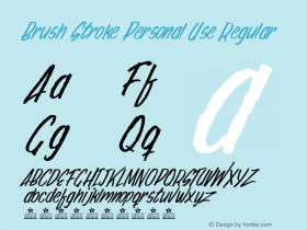
African shirt. The Olembe alphabet has an element of the handmade and the brush stroke.
"For the African series of numbers I was interested in making letters that had an element of the handmade and the brush stroke. I had seen at previous African Cup of Nations how the fans enjoyed displaying loyalty, by painting their bodies and writing the names of their favourite players. These letters – whilst copying traditional sans forms for example – express a wonderful kind of joy and exuberance. Obviously within a typeface only a certain part of the spirit of the script can be capture; it can't have multiple variants of the same glyph for example."

Specimen of Olembe in all caps setting.
"With the non-African teams, again they had concepts and designs of the product. They had developed a PowerCat concept. The lettering style reflected the simple geometric lettering traditionally related to sport, but also a simple no-nonsense technical form. It has echoes of the upright chancery italic as well, but only the slightest one. The numbers have a slightly different feel; they have the outer forms of a typical grotesque, but the interiors have a geometric feel."

FIFA Equipment Regulations for numbers.

FIFA Equipment Regulations for names.
How was the communication with the client?
P A U L B A R N E S| "I worked very closely with the design team at Puma; I presented a number of options before I came to these. After we had decided on a direction, the designs took two to three months to finish. During this time the designs had to be approved by FIFA and UEFA. Matthias Wagner, who works as a graphic designer for Puma in Herzogenaurach, Nürnberg, was very helpful in this process and really co-ordinated the whole thing."
A question from reader and fellow Typophile Nina Stössinger – who decides whose teams' names are set in all caps, or with lowercase?
P A U L B A R N E S| "I expected to see Crepello set in title case (capitalised lowercase), though in the world cup Puma set them in lowercase, as they did in the previous world cup. The African teams are set in uppercase. Only the position and the size of number and name are defined in the FIFA Equipment Regulations document. Those regulations do not stipulate what case the names should be in, that is decided by the manufacturer. In general they are upper case, but in more recent years all lower case and title case has become popular."


Home (top and bottom right) and away (bottom left) shirts for Cameroon. The hand painted origins of the characters is visible in the paint brush structure in the numbers.


Home and away shirts for Ghana.


Home and away shirts for Côte d'Ivoire.


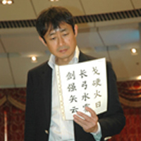
Inspiration for Olembe, the typeface on the African shirts.


-
 ShanhaiFonts
Brand:山海字库
Area:China

-
 Cangji Fonts
Brand: 仓迹字库
Area: China
-
 JT Foundry
Brand: 翰字铸造
Area: Taiwan, China

-
 Handmadefont
Brand:
Area: Estonia

-
·千图字体
-
 HyFont Studio
Brand: 新美字库
Area: China


- ·Quimbaya Coffee Roasters
- ·Iconic Transport for London logo undergoes subtle redesign
- ·The Future of Sex poster
- ·Ad for Hello Dummy! by Don Rickles
- ·"Fantastic!" ad for Captain Fantastic & the Brown Dirt Cowboy by Elton John & Bernie Taupin
- ·Ad for Vincebus Eruptum by Blue Cheer
- ·Japanese Typography Writing System
- ·He Invented a Font to Help People With Dyslexia Read
- ·Make market-ready fonts with this 8 point checklist
- ·47 free tattoo fonts for your body art