


Baseline
Baseline" src="http://typographydeconstructed.com/wp-content/uploads/2010/12/baseline-white.gif" alt="Baseline" width="190" height="190" />The invisible line where all characters sit.
In the example to the right, the letter 'p' has a descender; the other letters sit on the (red) baseline.
Most, though not all, typefaces are similar in the following ways as regards the baseline:
capital letters sit on the baseline. The most common exceptions are the J and Q.Lining figures (see Arabic numerals) sit on the baseline.The following text figures have descenders: 3 4 5 7 9.The following lowercase letters have descenders: g j p q y.Glyphs with rounded lower extents (0 3 5 6 8 c C G J o O Q U) dip very slightly below the baseline ("overshoot") to create the optical illusion that they sit on the baseline. Peter Karow's Digital Typefaces suggests that typical overshoot is about 1.5%.
The vertical distance of the base lines of consecutive lines in a paragraph is also known as line height or leading, although the latter can also refer to the baseline distance minus the font size.


-
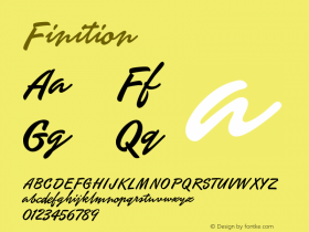
 Cangji Fonts
Brand: 仓迹字库
Area: China

-
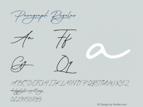
 JT Foundry
Brand: 翰字铸造
Area: Taiwan, China

-
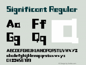
 Handmadefont
Brand:
Area: Estonia

-
·千图字体
-
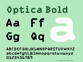
 HyFont Studio
Brand: 新美字库
Area: China
-
 Minrui Type
Brand: 敏锐字库
Area: China


- ·Type terms: the animated typographic cheat sheet
- ·London Underground's iconic Johnston Sans typeface
- ·Once Upon DESIGN: New Routes for Arabian Heritage
- ·How to Read a Painting by Patrick de Rynck
- ·Surabaya Beat by Beat Presser, Afterhours Books
- ·MC5 – Back in the USA album cover
- ·Make market-ready fonts with this 8 point checklist
- ·Alphabet Stories by Hermann Zapf
- ·Ad for Vincebus Eruptum by Blue Cheer
- ·Statement and Counter-Statement, Automatically Arranged Alphabets, and Arts/Rats/Star