


Wir und ich und Du! newspaper


License: All Rights Reserved.
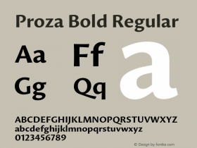
Front page of issue 2/2014
Prozaas the main typeface, making good use of the better part of its 12 styles. Dietmar Liehr comments:
The chosen size is very large for body text, because visually impaired readers are part of the target group. For them, the clear shapes of a sans serif are crucial. Proza combines this aspect with a warmth that is evoked by the varied stroke width of the implied broad nib. Like few other typefaces, Proza truly earns the name of a "humanist" sans serif.
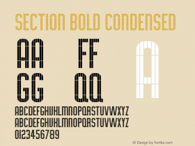
It is paired with two stylistically related typefaces: The nameplate uses two weights of the less calligraphic and more containedAgilita. For the main headline, Proza Bold is contrasted with the monolinearIdeal SansThin, which is lighter than what Proza's weight range has to offer.

Source: http://www.bistum-augsburg.de.Behindertenseelsorge im Bistum Augsburg. License: All Rights Reserved.
Detail of the Events section from issue 2/2015

License: All Rights Reserved.

License: All Rights Reserved.

Photo: Jasper de Waard. Liehrdesign. License: All Rights Reserved.


-
 ShanhaiFonts
Brand:山海字库
Area:China

-
 Cangji Fonts
Brand: 仓迹字库
Area: China
-
 JT Foundry
Brand: 翰字铸造
Area: Taiwan, China

-
 Handmadefont
Brand:
Area: Estonia

-
·千图字体
-
 HyFont Studio
Brand: 新美字库
Area: China


- ·Fonts Design of Childhood Memory
- ·Jim Nutt: Coming Into Character at Museum of Contemporary Art Chicago
- ·Alphabet Stories by Hermann Zapf
- ·"Fantastic!" ad for Captain Fantastic & the Brown Dirt Cowboy by Elton John & Bernie Taupin
- ·Statement and Counter-Statement, Automatically Arranged Alphabets, and Arts/Rats/Star
- ·Make market-ready fonts with this 8 point checklist
- ·Ad for Hello Dummy! by Don Rickles
- ·Food Not Bombs hypothetical redesign
- ·The Future of Sex poster
- ·Chinese College Student Invents Smog Font