


What's new in web type for 2016?
Whether you're wanting to learn how to start a blog or simply in need of a little web design inspiration, it's vital to keep up-to-date with the ever-cahnging faces of the web. Here are three trends in type that I've been noticing lately and that I expect to see more of throughout 2016:
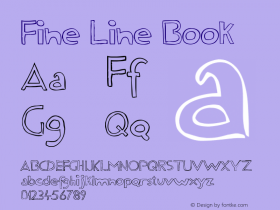
Heavy serifs
 Heavy, high-contrast serifs such as Noe Display will continue to become more popular
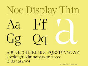
Heavy, high-contrast serifs such as Noe Display will continue to become more and more popular, as high-density displays are better able to render the fine lines of serifs like these.
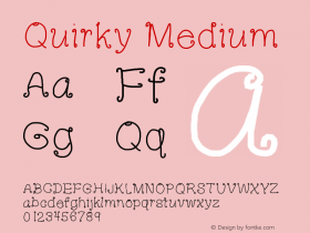
Playful sans-serifs
 Quirky, geometric sans-serifs such as GT Walsheim are trendy at the moment
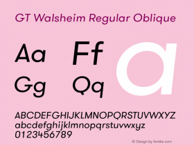
Quirky, geometric sans-serifs such as GT Walsheim are trendy at the moment. This style of typeface takes the geometric model of Futura and adds a few playful touches, creating warmth.
Type diversity
 Expect to see a more diverse use of type on the web in 2016
I think we'll see a more diverse use of type on the web in 2016. People are sick of seeing the same small handful of typefaces used everywhere. Typewolf is a great place to discover new typefaces from indie foundries.


-
 ShanhaiFonts
Brand:山海字库
Area:China

-
 Cangji Fonts
Brand: 仓迹字库
Area: China
-
 JT Foundry
Brand: 翰字铸造
Area: Taiwan, China

-
 Handmadefont
Brand:
Area: Estonia

-
·千图字体
-
 HyFont Studio
Brand: 新美字库
Area: China


- ·Ad for Vincebus Eruptum by Blue Cheer
- ·Type terms: the animated typographic cheat sheet
- ·Brother Moto Flat-Trackin' Tee
- ·"David Bowie is turning us all into voyeurs" button
- ·Alphabet Stories by Hermann Zapf
- ·Japanese Typography Writing System
- ·Linotype Ad: "Linotype vs. Intertype"
- ·Königsblut identity
- ·MC5 – Back in the USA album cover
- ·"Fantastic!" ad for Captain Fantastic & the Brown Dirt Cowboy by Elton John & Bernie Taupin