Citymapper identity (2013–)


Source: https://citymapper.com.License: All Rights Reserved.
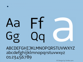
In late 2013Proxima Nova Soft. It was a major improvement over their previous logotype, and reinforced the modern, approachable tone of their brand. The simple line drawings used throughout Citymapper's promotional material match the typeface's strokes and style.

Source: https://citymapper.com.License: All Rights Reserved.

Source: https://citymapper.com.License: All Rights Reserved.

Source: https://citymapper.com.License: All Rights Reserved.

Source: https://citymapper.com.License: All Rights Reserved.

Source: https://citymapper.com.License: All Rights Reserved.
The only major drawback for Proxima Nova Soft: no Cyrillic. The St. Petersburg label here falls back to Helvetica, Arial, or the visitor's sans-serif default.

Source: https://citymapper.com.License: All Rights Reserved.

Source: https://citymapper.com.License: All Rights Reserved.

Source: https://citymapper.com.License: All Rights Reserved.
-
 ShanhaiFonts
Brand:山海字库
Area:China

-
 Cangji Fonts
Brand: 仓迹字库
Area: China

-
 JT Foundry
Brand: 翰字铸造
Area: Taiwan, China

-
 Handmadefont
Brand:
Area: Estonia

-
·千图字体
-
 HyFont Studio
Brand: 新美字库
Area: China

- ·"David Bowie is turning us all into voyeurs" button
- ·Linotype Ad: "Linotype vs. Intertype"
- ·Alibaba Supports Font Infringement Complaints
- ·How to sell your typefaces
- ·"Jesus Music" ad for Myrrh Records
- ·Sinnesreize / Embracing Sensation by Silvia Gertsch and Xerxes Ach
- ·Troubadour poster, Opera Plovdiv
- ·47 free tattoo fonts for your body art
- ·He Invented a Font to Help People With Dyslexia Read
- ·Bevésett nevek (Carved Names), vol. 2


