


London Transport ad: Edward Johnston


Source: https://www.flickr.com.Uploaded to Flickr by Mike Ashworth and tagged with "johnston". License: All Rights Reserved.
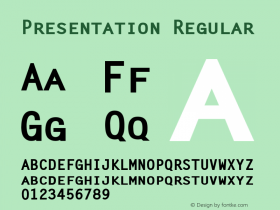
A remarkable 1937 advert issued by London Transport and extolling the organisation's long-standing policy regarding presentation and design, emphasising the use of the Johnston typeface — a variation of which we in London Underground still use today. Interestingly the text claims 1917 as the date of commissioning. We currently say 1913 for commissioning and 1916 for delivery — an interesting discrepancy! The use of the typeface, that is as noted the forerunner of the "modern" sans-serif typefaces, looks very "clean" and simple here on the page.
That Edward Johnston was commissioned in 1917 to design the sanserif type in which this announcement is set (the forerunner of the twentieth-century revivals of this letter-form) — that Feliks Topolski was commissioned last year to draw a series of character studies — these are but two examples of London Transport's consistent policy of a keen and practical intererst in sound presentation. Advertise, therefore, in good company through London Transport's vehicles, stations and publications to 9,500,000 people.


-
 ShanhaiFonts
Brand:山海字库
Area:China

-
 Cangji Fonts
Brand: 仓迹字库
Area: China
-
 JT Foundry
Brand: 翰字铸造
Area: Taiwan, China

-
 Handmadefont
Brand:
Area: Estonia

-
·千图字体
-
 HyFont Studio
Brand: 新美字库
Area: China


- ·The Form Book by Borries Schwesinger
- ·Bevésett nevek (Carved Names), vol. 2
- ·How to Read a Painting by Patrick de Rynck
- ·New York New York, Jazz St. Louis
- ·He Invented a Font to Help People With Dyslexia Read
- ·XUID Arrays: One Less Thing To Worry About
- ·Jim Nutt: Coming Into Character at Museum of Contemporary Art Chicago
- ·Cocoa Marsh Instant Fudge Candy Mix packaging
- ·London Underground's iconic Johnston Sans typeface
- ·Königsblut identity