


Bavaria blu


Photo: Florian Hardwig. License: CC BY-SA.
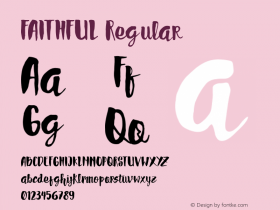
Bayreuth, a bold and condensed Fraktur designed by Ernst Schneidler in the 1930s, has been used for the logo and the packaging ever since. In the first decades, the letterforms used for the brand were faithful to the original typeface design. In a redesign done in the 1990s, Bayreuth got simplified, most notably in the 'B' or the terminals of 'b' and 'l'.
In the Schneidler monograph, Max Caflisch observes: "In the lowercase [of Bayreuth], there are numerous letter parts which are systematically treated the same way: the top and left parts of a g q and, vice versa, the right parts of b d o p v w or h and y." This homogenization is amplified in the streamlined revision: the 'a' is now almost congruent with 'v'.

Source: http://www.bergader.de.Bergader. License: All Rights Reserved.
"The first Bavaria blu was very playful and ornate – the way they liked it in the 70s – and the successor design used from the end of 1988 to the late 90s was still very true to the original design."

Source: http://www.bergader.de.Bergader. License: All Rights Reserved.
"In the 1990s there followed a rather more extensive adjustment to the design: Bavaria blu acquired a new, modern, minimalist look. The brand name lettering and the unmistakable reference to the Bavarian origin were kept."

License: All Rights Reserved.
"Bavaria blu" in unmodified Bayreuth.

Source: http://www.mambo.com.br.Mambo. License: All Rights Reserved.
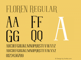
The secondary typeface isFlorensby Garrett Boge (LetterPerfect). Waging, the home of Bavaria blu, is about halfway between Bayreuth and Florence – conincidence? The ampersand in Florens apparently was considered too fancy and got replaced.

Source: http://m.mynetfair.com.mynetfair. License: All Rights Reserved.
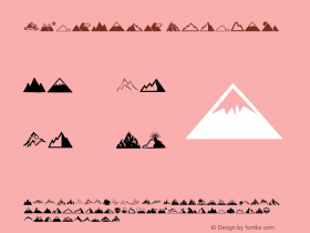
The local Bergader mountain – the Watzmann – is depicted on the packaging since a redesign in 1998.

Source: http://winetime.com.ua.Winteime. License: All Rights Reserved.

Photo: Florian Hardwig. License: CC BY-SA.


-
 ShanhaiFonts
Brand:山海字库
Area:China

-
 Cangji Fonts
Brand: 仓迹字库
Area: China
-
 JT Foundry
Brand: 翰字铸造
Area: Taiwan, China

-
 Handmadefont
Brand:
Area: Estonia

-
·千图字体
-
 HyFont Studio
Brand: 新美字库
Area: China


- ·Quimbaya Coffee Roasters
- ·Japanese Typography Writing System
- ·Brother Moto Flat-Trackin' Tee
- ·The Form Book by Borries Schwesinger
- ·Königsblut identity
- ·Cocoa Marsh Instant Fudge Candy Mix packaging
- ·Statement and Counter-Statement, Automatically Arranged Alphabets, and Arts/Rats/Star
- ·New York New York, Jazz St. Louis
- ·Troubadour poster, Opera Plovdiv
- ·Ad for Hello Dummy! by Don Rickles