


Google Has a Brand New Logo, Here It Is
Google recently changed its logo a little. Now they've changed it a lot. And it's actually a heck of a lot better, too. I kinda love it.
The idea here is that Google doesn't need as much of logo anymore as it needs a constantly morphing identity that can quickly resonate across mediums, from smartwatches to apps to browsers. So yes, the typeface is changing (and not a moment too soon, gosh that thing was ugly), but there are also some new elements, some of which can be animated:
Advertisement
From the Google blog:
Today we're introducing a new logo and identity family that reflects this reality and shows you when the Google magic is working for you, even on the tiniest screens. As you'll see, we've taken the Google logo and branding, which were originally built for a single desktop browser page, and updated them for a world of seamless computing across an endless number of devices and different kinds of inputs (such as tap, type and talk).


-
 ShanhaiFonts
Brand:山海字库
Area:China

-
 Cangji Fonts
Brand: 仓迹字库
Area: China
-
 JT Foundry
Brand: 翰字铸造
Area: Taiwan, China

-
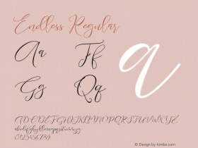
 Handmadefont
Brand:
Area: Estonia

-
·千图字体
-
 HyFont Studio
Brand: 新美字库
Area: China


- ·How to Read a Painting by Patrick de Rynck
- ·"David Bowie is turning us all into voyeurs" button
- ·47 free tattoo fonts for your body art
- ·Bevésett nevek (Carved Names), vol. 2
- ·Linotype Ad: "Linotype vs. Intertype"
- ·Why Apple Abandoned the World's Most Beloved Typeface?
- ·Iconic Transport for London logo undergoes subtle redesign
- ·Troubadour poster, Opera Plovdiv
- ·Cocoa Marsh Instant Fudge Candy Mix packaging
- ·Brother Moto Flat-Trackin' Tee