


LAMK website

Source: http://www.lamk.fi.License: All Rights Reserved.
Homepage, narrow view
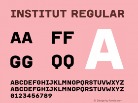
TheDia, a tribute to early grotesques issued by Finnish-German duo Schick Toikka earlier that year.
Dia is a type series in miniature: It reaches from light condensed to black extended, but leaves out all the rarely needed intermediate styles. "Dia's express pride in cherry-picking the quirk from premodern superfamily poles reminds us to express more using less, with style", says Robb Ogle in his Typographica review. The LAMK website uses all four weights to great effect.
The website design as well as the whole brand identity was done by a group of design students at Lahti University of Applied Sciences, Institute of Design. Type designer Lauri Toikka is an alumni of this institute.

Source: http://www.lamk.fi.License: All Rights Reserved.

Source: http://www.lamk.fi.License: All Rights Reserved.

Source: http://www.lamk.fi.License: All Rights Reserved.

Source: http://www.lamk.fi.License: All Rights Reserved.
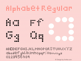
Alphabetical menu or type specimen?

Source: http://www.lamk.fi.License: All Rights Reserved.
Homepage


-
 ShanhaiFonts
Brand:山海字库
Area:China

-
 Cangji Fonts
Brand: 仓迹字库
Area: China
-
 JT Foundry
Brand: 翰字铸造
Area: Taiwan, China

-
 Handmadefont
Brand:
Area: Estonia

-
·千图字体
-
 HyFont Studio
Brand: 新美字库
Area: China


- ·Königsblut identity
- ·Once Upon DESIGN: New Routes for Arabian Heritage
- ·The Form Book by Borries Schwesinger
- ·20 Houses. A New Residential Landscape exhibition, Wallpaper* Architects Directory
- ·How to sell your typefaces
- ·MC5 – Back in the USA album cover
- ·New York New York, Jazz St. Louis
- ·Chinese College Student Invents Smog Font
- ·How House Industries Designs Its Retrotastic Logos and Typefaces
- ·Type terms: the animated typographic cheat sheet