


Fontke.com>Article>Details
A painful alphabet created for Men's Health magazine
IntroductionSawdust is a design studio composed of two talented graphic desig
Sawdust is a design studio composed of two talented graphic designers, Rob Gonzalez and Jonathan Quainton. The two creatives have often been awarded for their typographic and branding work.
Their typographic project for Men's Health magazine strikes gold once again. The X-rays of broken words re-composed in letters will just make the readers scream.
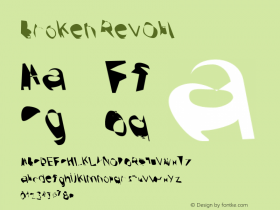
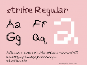
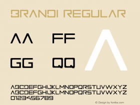
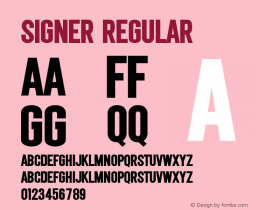
Relevant font family


A painful alphabet created for Men's Health magazine Comments
A painful alphabet created for Men's Health magazine Latest comments
No relevant comments
-
 Cangji Fonts
Brand: 仓迹字库
Area: China

-
 JT Foundry
Brand: 翰字铸造
Area: Taiwan, China

-
 Handmadefont
Brand:
Area: Estonia

-
·千图字体
-
 HyFont Studio
Brand: 新美字库
Area: China
-
 Minrui Type
Brand: 敏锐字库
Area: China


Recommended font article
- ·How to sell your typefaces
- ·Troubadour poster, Opera Plovdiv
- ·Alphabet Stories by Hermann Zapf
- ·20 Houses. A New Residential Landscape exhibition, Wallpaper* Architects Directory
- ·"Die Alpen – Vielfalt in Europa" stamp
- ·Make market-ready fonts with this 8 point checklist
- ·London Underground's iconic Johnston Sans typeface
- ·Cocoa Marsh Instant Fudge Candy Mix packaging
- ·New York New York, Jazz St. Louis
- ·Moving Hands (Helena Hauff Remix) by The Klinik, official video