


Fontke.com>Article>Details
In These Changing Times / Right Before My Eyes by Four Tops
IntroductionSource: http://images.45cat.com.EMI Music Germany/Motown. License


Source: http://images.45cat.com.EMI Music Germany/Motown. License: All Rights Reserved.
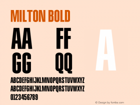
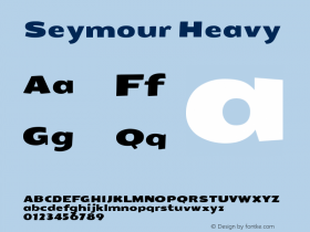
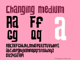
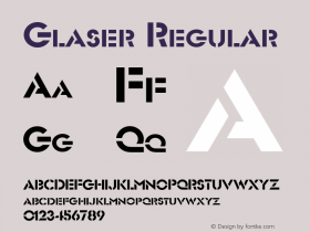
This sleeve was designed for the German release of In These Changing Timesby Four Tops. The multiline typeface used for the group's name is Milton Glaser and Seymour Chwast'sFilmsense.Futurais used for the title.
Relevant font family


Relevant font designer

In These Changing Times / Right Before My Eyes by Four Tops Comments
In These Changing Times / Right Before My Eyes by Four Tops Latest comments
No relevant comments
-
 ShanhaiFonts
Brand:山海字库
Area:China

-
 Cangji Fonts
Brand: 仓迹字库
Area: China
-
 JT Foundry
Brand: 翰字铸造
Area: Taiwan, China

-
 Handmadefont
Brand:
Area: Estonia

-
·千图字体
-
 HyFont Studio
Brand: 新美字库
Area: China


Recommended font article
- ·New York New York, Jazz St. Louis
- ·Sinnesreize / Embracing Sensation by Silvia Gertsch and Xerxes Ach
- ·Quimbaya Coffee Roasters
- ·Food Not Bombs hypothetical redesign
- ·Benetton identity redesign
- ·The Future of Sex poster
- ·Alphabet Stories by Hermann Zapf
- ·Linotype Ad: "Linotype vs. Intertype"
- ·Bevésett nevek (Carved Names), vol. 2
- ·Type terms: the animated typographic cheat sheet