


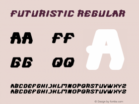
Why You've Never Heard of This Typeface That Defined the 1980s
Apple, Trapper Keeper, and Reebok: Three of the most well-known brands of the 1980s, and three companies that used the same futuristic-looking typeface to do it. So why isn't the typeface a classic like other period pieces *cough*Helvetica*cough*? Fate is a funny thing.
Today Fonts In Use and BrandNew point out the odd case of Motter Tektura, a typeface created in 1975 by the Austrian designer Othmar Motter, who died in 2010. If you were alive in the late 1970s or 80s, you'll recognize it as the former font used in Apple's early logos, as well as those of Trapper Keeper and Reebok—which kept it in use well into contemporary times.
Tektura actually played a major role in the evolution of Apple's identity. And when the company adopted it as its logo type, the bite mark was rounded out to fit Tektura's curved "A" letterform, and it stayed that way long after Tektura was retired:
Advertisement
In fact, you could argue that Apple's in-house typefaces like Chicago mimic certain aspects of Tektura. Steve Jobs even used Tektura on his business cards in 1979:


-
 ShanhaiFonts
Brand:山海字库
Area:China

-
 Cangji Fonts
Brand: 仓迹字库
Area: China
-
 JT Foundry
Brand: 翰字铸造
Area: Taiwan, China

-
 Handmadefont
Brand:
Area: Estonia

-
·千图字体
-
 HyFont Studio
Brand: 新美字库
Area: China


- ·Ad for Vincebus Eruptum by Blue Cheer
- ·Fonts Design of Childhood Memory
- ·Cher Got Sued For Font!
- ·Chinese College Student Invents Smog Font
- ·Moving Hands (Helena Hauff Remix) by The Klinik, official video
- ·Why Apple Abandoned the World's Most Beloved Typeface?
- ·Brother Moto Flat-Trackin' Tee
- ·Troubadour poster, Opera Plovdiv
- ·Bevésett nevek (Carved Names), vol. 2
- ·Alphabet Stories by Hermann Zapf