Wicked Problems In Type Design

Don't ask me how I came across this video this weekend – I guess it must have been Twitter – but Wicked Problems in Type Design is an interesting document of a 2012 presentation at Cooper-Hewitt. In conjunction with its exhibition Graphic Design: Now In Production on exhibit in New York City that summer, the Cooper-Hewitt National Design Museum invited six leading and emerging voices in the field of type design whose work appeared in the exhibition. Each was asked to give a Pecha Kucha-style presentation (20 slides of 20 seconds each, six minutes and 40 seconds in total) on a wicked problem central to their work – a 'wicked problem' being a technical term for a type of problem that is important but not well-defined. The talks were followed by a panel discussion afterwards.
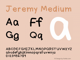
French designer Philippe Apeloig gave insight in his inspiration and creation process for typefaces he custom designs for identities and posters; William Berkson used his own Williams Caslon Text to explain how type design can improve readability; Hubert Jocham gave his interpretation on how to properly design a revival; Henrik Kubel elaborated on his collaborations with Margaret Calvert; Jeremy Mickel presented a frankly insane font to create three-letter monograms; and Jesse Ragan talked about his stone carvings for the New York Public Library. The event was moderated by Ellen Lupton and Cara Di Edwardo.
-
 ShanhaiFonts
Brand:山海字库
Area:China

-
 Cangji Fonts
Brand: 仓迹字库
Area: China

-
 JT Foundry
Brand: 翰字铸造
Area: Taiwan, China

-
 Handmadefont
Brand:
Area: Estonia

-
·千图字体
-
 HyFont Studio
Brand: 新美字库
Area: China

- ·Ad for Vincebus Eruptum by Blue Cheer
- ·"Die Alpen – Vielfalt in Europa" stamp
- ·Cher Got Sued For Font!
- ·Food Not Bombs hypothetical redesign
- ·He Invented a Font to Help People With Dyslexia Read
- ·Bevésett nevek (Carved Names), vol. 2
- ·The Future of Sex poster
- ·Jim Nutt: Coming Into Character at Museum of Contemporary Art Chicago
- ·Ad for Hello Dummy! by Don Rickles
- ·MC5 – Back in the USA album cover


