


Focus On FontStructors – Tobias Sommer (shasta)

This is the sixth in our series of mini-interviews with FontStructors. In this instalment we talk to Tobias Sommer, better known on Em42 interview just the day before. It was particularly funny that he ended his comment with: "(…) A very well-deserved article! They're doing a great job picking out top FontStructors so far." without him or me knowing he would receive an invitation himself the very next day. How's that for a coincidence?
Tobias Sommer (shasta)

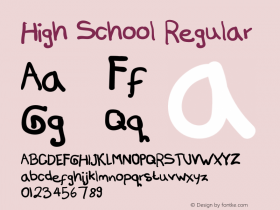
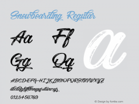
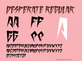
Tobias Sommer was born 23 years ago in St. Gallen, a small, quiet town in the east of Switzerland. Growing up drawing and scrawling a lot, he went through high school, discovered his interests for graphic design, photography, languages, music, politics, history, literature, snowboarding, mountain biking, geography, creative writing and whatnot, and of course ended up not having a clue what the heck to choose of all these things to do professionally. Thankfully many of them "fell away due to lack of talent" (as he says so himself), and so he ended up having to choose between design or languages/politics/history. Tobias then started studying Interaction Design at Zurich University of Arts, stopped after a year and switched to International Affairs in Geneva. And that's where he is now: studying and enjoying life in Geneva.
Tobias randomly ran into FontStruct on some web design award site, one or two weeks after it was released.
Punched Out and Punched Out Fill by Shasta
You started on Fontstruct very early after the launch. What were your first impressions?
Well, we fell in love at first sight. We've been a happy couple ever since. Of course we have our ups and downs at times, but it's looking pretty good. :)
It was by the way very impressive to notice how many FontStructors and FontStructions were already there when I first got on the site. I only realised how young the site actually was when they posted the "21 Days" post (The First Three Weeks) on the blog. Someone had done some good PR there!
You did one year of Interaction Design, but did you have any actual experience with graphic or type design?
I think I'm one of the few regular FontStructors who don't make a living with anything related to graphic design, typography, or other creative stuff. As a regular student, the only connection points to the design world in my professional life are the eye cancer provoking PowerPoint presentations of our professors.
Great Depression by Shasta
Still I can't deny having a past with design. First of all, my whole family's pretty fond of design and visual arts in general. As I mentioned, I myself started studying design, but switched to International Affairs after one year. That year at the University of Arts certainly was a big step ahead for my design skills, but it also made me realise that keeping design just as a hobby along the way might be enough. And that works great so far.
Type design on the other hand was pretty new to me. I had always been very interested in the subject, right from my very first attempts with graphic design (drawing pixel logos for my own imaginary brand in Microsoft Paint at the age of 12… Yee-hah!). Yet my sporadic and desperate attempts to find appropriate software to put my ideas into practice always found a sudden and bitter end, either at the price of the program or the size of its manual. So discovering FontStruct was pure bliss, and the starting point of my type design "career".
Cupra by Shasta
You mention the "eye cancer provoking PowerPoint presentations of our professors". Do you remember when you started noticing such things? As I know the feeling, I was wondering inhowfar it distracts you from the actual content being presented, and how compelled you sometimes might feel to redesign the damn things? :)
(Laughs) Good question. I'm not sure when exactly I started noticing how bad some things are designed, but I guess the progressive sensitisation to this phenomenon is a key aspect in every designer's development. It probably starts when as a child you realise for the first time that your black T-shirt adorned with dolphins jumping over orange Caribbean sunsets might not be the most beautiful thing in the world, and ends when you want to throw books at professors for using Times News Roman on their slides again. OK, it probably doesn't end there, but you know what I mean. For me this moment was quite certainly the most intense after coming from Art University. There everything is sleek and beautiful and you get booed for not having your titles perfectly aligned on your presentations, whereas at normal university most people only care about content, and not a second about form. Those were pretty painful moments for my retina. Especially when they force you to use typefaces that make you shiver just so they can compare the length of your essay to others. :)
Anyway, you mentioned the distracting aspect of bad design. The main problem is that poor design often goes hand in hand with poor structure. I think I could even live with Comic Sans and rainbow backgrounds, as long as the content was consistently structured. But when they randomly use five different typefaces and seven different layout concepts within one single presentation, it becomes practically impossible to understand the structure and the hierarchy of the content. This causes hours of additional work for every student, whereas a redesign and a good structure of these presentations would probably take the same amount of time for one person only. I usually do redesigns whenever I get the raw PowerPoint files from professors, and always insist on doing the collect-and-harmonise job when we have to do group assignments. Self-flagellation in the service of aesthetics…
Disparador by Shasta
Which of your friends and/or co-students know you now design type, and what was their reaction when they found out?
There's only a few of them who know I do that, and even fewer who are actually interested in it. I think the most common reactions are that they call me a freak or a nerd, tell me the exams are getting pretty close or ask if this is why I have these dark circles around my eyes. (laughs) But well, I can live with the fact that typography is a pretty specific hobby that you don't share with every second person in the world.
How aware do you think they are of typography and fonts?
Most of my co-students are either completely uninterested in the subject, or their interest goes as far as to replace the standard fonts with things like Papyrus in their essays, and then I often think they'd be better off with no interest in typography at all.
I've recently started exposing some of my FontStructions on Facebook, to reach some of my more design-interested friends, but there too the feedback is pretty lean. That's by the way one of the slightly bitter things about FontStructing in my opinion: it mostly seems to rotate around itself and the amazing, but relatively small active community on the site. If you don't have any means to show your work to a greater audience (like a well-frequented blog or online portfolio), you'll have to live with that.
Teatral and Teatral Stencil by Shasta
Talking about that relatively small active community, what are your thoughts on the voting system as opposed to the Top Picks selected by the FontStruct Staff?
Phew… Obviously the voting system as well as the Top Pick system have been subject to a lot of discussions recently. I understand why people are sometimes unhappy with any of the two systems. If you publish a font you've been working on for several hours or even days and then it either gets random 1's or doesn't get the pink badge even when you think it'd deserve it, it can be very frustrating and painful to see your work flushed away into oblivion among the 8,000 something mostly mediocre FontStructions. I myself have in my opinion a few pretty solid designs that somehow slipped under the eyes of the admins, and I consider myself lucky if they get downloaded ten times like this, whereas the same typeface with a Top Pick would easily get twenty times as much.
Still I've recently come to the conclusion that the current system is probably not too bad after all. In the end it's simple, doesn't leave the admins with an insurmountable amount of work, and even the despised font trolls somehow contribute to some justice when they downvote high-rated typefaces: they constantly refresh the ranking, always giving new designs a chance to get some fame. I'm actually more worried by the "font fairies" that give 10's to every halfway decent font. Though this is very well-meaning and really shows the encouraging atmosphere on FontStruct, it tends to cement the upper regions of the ranking with typefaces are virtually imossible to surpass anymore, even with a true masterpiece.
But in the end all these things shouldn't bother people too much. Constant good work always gets rewarded eventually. If it's not by instant Top Picks and 9+ ratings, then it's with a good reputation and the respect of your fellow FontStructors… Which in the end is worth more than any formal distinction.
Escheresk by Shasta
We were quite impressed by a recent Top Pick from you that we promoted to Featured FontStruction, your M.C. Escher tribute Escheresk. Where do you get your inspiration for creating new FontStructions?
I find it pretty hard to retrace how and where I got the inspiration for my fonts. Sometimes it's a design I see somewhere or an existing font that inspires me, but mostly it just seems to come out of nowhere. In the case of Escheresk I couldn't even tell you when or how I came upon that idea. It probably just started scribbling impossible polygons on my sheets during some boring lecture, and somehow turned them into letters.
I also have to admit that there isn't any bigger theme or concept behind my work. I just take the ideas as they come and make the fonts I have in mind, but I simply wouldn't have the patience and expertise to seek perfection within a certain genre. The only "concepts" I try to implement in every FontStruction I make are usability, consistency and completeness. Guess I'm pretty Swiss in this regard…
Exempla Slab Serif by Shasta
As a final note I think I particularly like FontStructing because creating a typeface to me sometimes feels more like "watching the face grow": you have an initial idea for maybe two or three characters that you think would look cool (you could call that the seed), and in there is already an implicit set of rules for all the other characters (the DNA). Then you just go from letter to letter and see what the rules make it look like. In the end you have a full grown typeface and you find yourself pretty surprised by how great some of the characters look. That's very rewarding, and the great thing about it is that you don't have to be the full-time ultra-creative mutant brain to do it. One good idea now and then is enough.
Capitalia Rounded by Shasta


-
 ShanhaiFonts
Brand:山海字库
Area:China

-
 Cangji Fonts
Brand: 仓迹字库
Area: China
-
 JT Foundry
Brand: 翰字铸造
Area: Taiwan, China

-
 Handmadefont
Brand:
Area: Estonia

-
·千图字体
-
 HyFont Studio
Brand: 新美字库
Area: China


- ·Bevésett nevek (Carved Names), vol. 2
- ·Cher Got Sued For Font!
- ·Why Apple Abandoned the World's Most Beloved Typeface?
- ·Statement and Counter-Statement, Automatically Arranged Alphabets, and Arts/Rats/Star
- ·20 Houses. A New Residential Landscape exhibition, Wallpaper* Architects Directory
- ·How to Read a Painting by Patrick de Rynck
- ·How House Industries Designs Its Retrotastic Logos and Typefaces
- ·How to sell your typefaces
- ·Chinese College Student Invents Smog Font
- ·Cocoa Marsh Instant Fudge Candy Mix packaging