


An interview with Botio Nikoltchev, type designer
We had the chance to ask a few questions to Botio Nikoltchev, a young talented font designer. You'll be interested in discovering his work and what he has to say about it.
Hi Botio, can you introduce yourself to our readers?
I am a typical Bulgarian guy born in Sofia. In the late 90s I choosed to live in Berlin, the best city ever (but don't visit it in winter). I love boxing, typography, yoga, music and partys. Actually, after writing this I realized that these few things are taking me a lot of time…
You recently published Ropa Sans Pro, what where your goals when designing it?
I didn't have any concrete goals designing the Ropa Sans family. I've been doing a lot of custom and corporate fonts in the recent years, and all of them have had very specific and precise requirements. That's why I decided to make the Ropa Sans with no constraint, just the way I like it.
Can you introduce your other fonts to us, and which one is your favorite?
My first release in 2010 was the PTL Manohara. It is a dynamic, humanistic typeface with Latin and Cyrilic range and smlall caps characters. At that time I also worked together with Ole Schäfer on the Cyrillic characters of PTL Manual, PTL Manual Mono and PTL Notes.
I published also a small fun-font on Google web fonts – its called Sofadi, it was a project I did during my study at the University of Applied Science Potsdam.
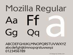
Together with Erik Spiekermann and Raph du Carrois I worked on the Meta Serif Cyrillic and Greek and also on the Meta Science, witch is a huge font family with a character set of about 2800 Glyphs. And the last year we finished also the Fira Sans for Mozilla Firefox. It is a very nice open source font family. My favorite one is my new one – its called Nomi and it is a wonderful typeface.
Who is your favorite type designer, and what is your current favorite typeface?
I appreciate the work of Jovica Veljović very much. Mr. Veljovic is a calligrapher and type designer on a high end level. There are a lot of good type designers and a lot of good calligraphers, but to have that in one person on that level is very rare. Just take a look on Veljovic Script or Ex Ponto, this are two fantastic typefaces. My favorite typeface… that's a very difficult question… There are many awesome typefaces and it depends on the usage, the particular case or the purpose wich one I would choose.
What tools do you work with for designing typefaces?
Mostly, I work with FontLab and Glyphs. At the moment I'm testing the preview version of the new FontLab. And I can allready say that its quite cool. The FontLab team is working on a lot of new features, but I can't talk about that in details.
What advice would you give to someone, an amateur or a graphic designer, who wants to design a font?
Just do it!


-
 ShanhaiFonts
Brand:山海字库
Area:China

-
 Cangji Fonts
Brand: 仓迹字库
Area: China
-
 JT Foundry
Brand: 翰字铸造
Area: Taiwan, China

-
 Handmadefont
Brand:
Area: Estonia

-
·千图字体
-
 HyFont Studio
Brand: 新美字库
Area: China


- ·Amazon Releases Ember Bold Font for the Kindle
- ·Chinese College Student Invents Smog Font
- ·London Underground's iconic Johnston Sans typeface
- ·"Fantastic!" ad for Captain Fantastic & the Brown Dirt Cowboy by Elton John & Bernie Taupin
- ·Quimbaya Coffee Roasters
- ·10 Top Romantic Fonts on Valentine's Day!
- ·MC5 – Back in the USA album cover
- ·20 Houses. A New Residential Landscape exhibition, Wallpaper* Architects Directory
- ·Alibaba Supports Font Infringement Complaints
- ·Why Apple Abandoned the World's Most Beloved Typeface?