Netflix logo (1997–2014)


Source: https://pr.netflix.com.© Netflix. License: All Rights Reserved.
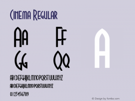
The logo for media streaming serviceGraphique, perhaps trimming the shapes at the bottom for that retro-cinematic curved baseline.
Graphique is a 1940s typeface credited to Swiss designer Hermann Eidenbenz, the man also partially responsible for the modern incarnation of Clarendon.
There are at least two digital versions of Graphique, ARType's Graphique-AR, which is a closer match to the metal specimens shown in Encyclopaedia of Typefaces and this Stempel specimen; and profonts' Graphique Pro which takes more liberties with the design (see the detached 'Q' tail, for instance) and has a larger character set. Graphique Pro is also wider than Graphique-AR, with a heavier outline, so it could be based on a smaller size of the metal type.

Source: https://pr.netflix.com.License: All Rights Reserved.
Netflix headquarters.

Source: http://blog.netflix.com.License: All Rights Reserved.
Netflix Android app.

Source: https://pr.netflix.com.License: All Rights Reserved.
Netflix on a TV set.

Source: http://netflix.com.License: All Rights Reserved.
The Netflix website. See also our entry on House of Cards.

Source: http://www.flickr.com.Image via Rainer Gerstenberg and Lars Schwarz. License: All Rights Reserved.
Specimen of the metal Graphique from D. Stempel AG.
-
 ShanhaiFonts
Brand:山海字库
Area:China

-
 Cangji Fonts
Brand: 仓迹字库
Area: China

-
 JT Foundry
Brand: 翰字铸造
Area: Taiwan, China

-
 Handmadefont
Brand:
Area: Estonia

-
·千图字体
-
 HyFont Studio
Brand: 新美字库
Area: China

- ·Moving Hands (Helena Hauff Remix) by The Klinik, official video
- ·"Fantastic!" ad for Captain Fantastic & the Brown Dirt Cowboy by Elton John & Bernie Taupin
- ·Iconic Transport for London logo undergoes subtle redesign
- ·The Future of Sex poster
- ·Sinnesreize / Embracing Sensation by Silvia Gertsch and Xerxes Ach
- ·Surabaya Beat by Beat Presser, Afterhours Books
- ·Brother Moto Flat-Trackin' Tee
- ·"Die Alpen – Vielfalt in Europa" stamp
- ·Antropofagia. Palimpsesto Selvagem
- ·"David Bowie is turning us all into voyeurs" button


