


Chalk Gyms


Source: http://www.stevehaslip.com.License: All Rights Reserved.
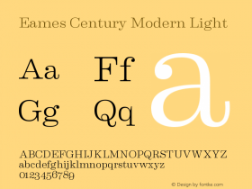
typeface plus color equals brand". Designer Steve Haslip built the gym's visual identity around Erik van Blokland's Eames Century Modern Stencil and the color orange, resulting in a brand that is immediately recognizable and distinct from any other gym in the area. In fact, the strength of the design arguably sets Chalk's brand apart from just about any other business in the world.
The primary logotype has slightly modified letterforms, most noticably the 'k' and the 'C', the latter of which was altered to look like a smiley face when turned sideways. An alternate chalky "sketch" rendering of the logo is used occasionally, but I personally prefer the graphic quality of the clean, solid, rendering.
Futura was a reletively mundane choice for a supporting typeface, but Eames Stencil adds enough flavor and interest to make up for it. The logotype's customized stencil 'C' is even distinct enough on its own to carry the identity down in scale for smaller icons and buttons.
The type and color scheme are maintained consistently and strongly across all media, including the gym's responsive website design and even in animated logos for a series of promotional videos. This kind of consistency and attention to design detail gives Chalk the outward appearance of a world-class gym, despite the fact that it's a single location and has only been open less than a year and a half. It's easy to imagine the Chalk brand expanding out into a larger franchise over time based on its visual identity alone.

Source: http://www.stevehaslip.com.License: All Rights Reserved.
Chalk's respnsive website maintans the strong orange + Eames Century Stencil brand.

Source: http://www.stevehaslip.com.License: All Rights Reserved.

Source: http://www.stevehaslip.com.License: All Rights Reserved.

Source: https://www.facebook.com.License: All Rights Reserved.

Source: http://www.youtube.com.License: All Rights Reserved.

Source: http://www.flickr.com.License: All Rights Reserved.

Source: http://www.flickr.com.License: All Rights Reserved.

Source: http://www.flickr.com.License: All Rights Reserved.

Source: http://www.flickr.com.License: All Rights Reserved.

Source: http://www.flickr.com.License: All Rights Reserved.

Source: http://www.flickr.com.License: All Rights Reserved.

Source: http://www.flickr.com.License: All Rights Reserved.

Source: http://www.stevehaslip.com.License: All Rights Reserved.

License: All Rights Reserved.
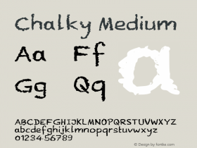
On top is a default setting of Eames Century Modern Stencil. Below is the Chalk logo with modified forms.

Source: https://www.facebook.com.License: All Rights Reserved.

Source: https://www.facebook.com.License: All Rights Reserved.

Source: http://www.youtube.com.License: All Rights Reserved.

Source: http://chalkgyms.com.License: All Rights Reserved.


-
 ShanhaiFonts
Brand:山海字库
Area:China

-
 Cangji Fonts
Brand: 仓迹字库
Area: China
-
 JT Foundry
Brand: 翰字铸造
Area: Taiwan, China

-
 Handmadefont
Brand:
Area: Estonia

-
·千图字体
-
 HyFont Studio
Brand: 新美字库
Area: China


- ·Benetton identity redesign
- ·The Form Book by Borries Schwesinger
- ·Alphabet Stories by Hermann Zapf
- ·10 Top Romantic Fonts on Valentine's Day!
- ·Type terms: the animated typographic cheat sheet
- ·Sinnesreize / Embracing Sensation by Silvia Gertsch and Xerxes Ach
- ·Make market-ready fonts with this 8 point checklist
- ·Antropofagia. Palimpsesto Selvagem
- ·He Invented a Font to Help People With Dyslexia Read
- ·How to Read a Painting by Patrick de Rynck