


"The anti-shoe" Campaign for MBT

Source: http://kastnerandpartners.com.Kastner and Partners. License: All Rights Reserved.
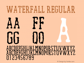
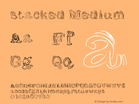
Gibberish copy, but in a lovely black Egyptian — Giza [edit: nope, it'sZiggurat, see comments]. The arrangement is reminiscent of two styles known from type specimen combined — stacked and justified lines, and the waterfall. Ironically, the decreasing type size feels like some higher power is turning down the volume, fading out an annoying carnival barker's voice.
Not only has the very pronounced punctuation of Giza been toned down. For some reason that is unclear to me, the letterforms themselves have been tinkered with, too. Most notably, terminals on 'a', 'f', 'r', 'y' etc. and the ear of 'g' have been rounded.

Source: http://kastnerandpartners.com.Kastner and Partners. License: All Rights Reserved.

Source: http://kastnerandpartners.com.Kastner and Partners. License: All Rights Reserved.

Source: http://kastnerandpartners.com.Kastner and Partners. License: All Rights Reserved.

Source: http://kastnerandpartners.com.Kastner and Partners. License: All Rights Reserved.

Source: http://kastnerandpartners.com.Kastner and Partners. License: All Rights Reserved.

Source: http://kastnerandpartners.com.Kastner and Partners. License: All Rights Reserved.


-
 ShanhaiFonts
Brand:山海字库
Area:China

-
 Cangji Fonts
Brand: 仓迹字库
Area: China
-
 JT Foundry
Brand: 翰字铸造
Area: Taiwan, China

-
 Handmadefont
Brand:
Area: Estonia

-
·千图字体
-
 HyFont Studio
Brand: 新美字库
Area: China


- ·"Fantastic!" ad for Captain Fantastic & the Brown Dirt Cowboy by Elton John & Bernie Taupin
- ·"Jesus Music" ad for Myrrh Records
- ·Make market-ready fonts with this 8 point checklist
- ·Linotype Ad: "Linotype vs. Intertype"
- ·How to Read a Painting by Patrick de Rynck
- ·Bevésett nevek (Carved Names), vol. 2
- ·Quimbaya Coffee Roasters
- ·Statement and Counter-Statement, Automatically Arranged Alphabets, and Arts/Rats/Star
- ·The Future of Sex poster
- ·He Invented a Font to Help People With Dyslexia Read