


字体设计基础(10)比例
Proportions. Which x-height to define? Which descender depth? Defining these proportions are essential, and very strongly connected to the purpose of the type. The proportions within a certain typeface are influencing the way your type will work & look. For example, it's impossible to create a space saving newspaper typeface with an extremely wide body width.
x高度应该定多高?下伸部应该多长?确定这些比例至关重要,并且与字体的用途紧密相关。字体的比例将影响其外观及应用。比如说,如果你想设计一种节约版面的字体,那就不能给它设置极大的字宽。
Extremely short descenders will give a strange look to a text typeface. Even worse, they might not be visible at all anymore. But extremely short descenders can also be a smart decision, while creating a display or headline type. For a text typeface the ascender height should be as big or, even better, bigger than then cap height to give a optical pleasurable result (see drawing).
如果下伸部很短,字体看上去会很怪。或者更糟,阅读者可能根本无法发现它。但很短的下伸部也可能是一个聪明的决定,当它用于特排字体或者标题字体的时候。 对一个正文字体来说,上伸部最好是和大写高度一样(或者更高一些更棒),以获得良好的视觉效果。如图。


-
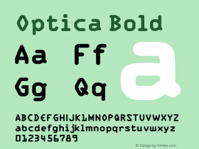
 ShanhaiFonts
Brand:山海字库
Area:China

-
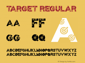
 Cangji Fonts
Brand: 仓迹字库
Area: China
-
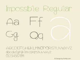
 JT Foundry
Brand: 翰字铸造
Area: Taiwan, China

-
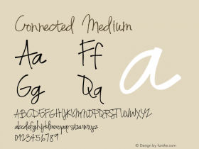
 Handmadefont
Brand:
Area: Estonia

-
·千图字体
-
 HyFont Studio
Brand: 新美字库
Area: China


- ·Ad for Vincebus Eruptum by Blue Cheer
- ·MC5 – Back in the USA album cover
- ·Antropofagia. Palimpsesto Selvagem
- ·Statement and Counter-Statement, Automatically Arranged Alphabets, and Arts/Rats/Star
- ·Alibaba Supports Font Infringement Complaints
- ·10 Top Romantic Fonts on Valentine's Day!
- ·Alphabet Stories by Hermann Zapf
- ·Barbe à papa Cotton Candy
- ·Sinnesreize / Embracing Sensation by Silvia Gertsch and Xerxes Ach
- ·"Fantastic!" ad for Captain Fantastic & the Brown Dirt Cowboy by Elton John & Bernie Taupin