


Ben Barry Design Portfolio


Source: http://designforfun.com.License: All Rights Reserved.
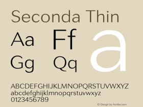
Alright Sans' many weights to suit each level of content. Thin and Medium for large intro text, Light and Regular for secondary text, and Medium for the extra small all-caps labels and navigation.

Source: http://designforfun.com.License: All Rights Reserved.

Source: http://designforfun.com.License: All Rights Reserved.

Source: http://designforfun.com.License: All Rights Reserved.
While the main intro text on all pages is set in Alright Sans Thin, secondary texts like this two-column chunk move up to the slightly heavier Light weight to maintain readability with the smaller type. The headline is in Regular.

License: All Rights Reserved.


-
 ShanhaiFonts
Brand:山海字库
Area:China

-
 Cangji Fonts
Brand: 仓迹字库
Area: China
-
 JT Foundry
Brand: 翰字铸造
Area: Taiwan, China

-
 Handmadefont
Brand:
Area: Estonia

-
·千图字体
-
 HyFont Studio
Brand: 新美字库
Area: China


- ·Benetton identity redesign
- ·The Form Book by Borries Schwesinger
- ·Alphabet Stories by Hermann Zapf
- ·10 Top Romantic Fonts on Valentine's Day!
- ·Type terms: the animated typographic cheat sheet
- ·Sinnesreize / Embracing Sensation by Silvia Gertsch and Xerxes Ach
- ·Make market-ready fonts with this 8 point checklist
- ·Antropofagia. Palimpsesto Selvagem
- ·He Invented a Font to Help People With Dyslexia Read
- ·How to Read a Painting by Patrick de Rynck