Town Planning by Thomas Sharp


Source: http://www.thingsmagazine.net.Image via Things Magazine. License: All Rights Reserved.
1942
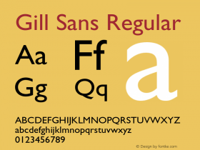
This title is an odd departure from theGill Sansthroughout. Personally, I find this type to be slightly more palatable than the Gill Extra Bold Display used here. Then again, I'm not British.
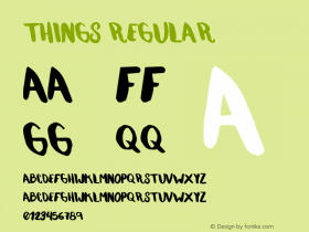
My best guess is that this type isTempoHeavy as evidenced by this specimen when you include the alts with pointed apexes ('A', 'N', 'M', 'W'). Only the bar-less 'G' is missing from that example. But, according to samples in McGrew, this form did appear in some versions of the face.
I was unable to find a credit for this design. I welcome anyone who can fill in the blanks. Incidentally, Thomas Sharp's book was fairly popular, being reprinted many times and selling 250,000 copies.

Source: http://www.thingsmagazine.net.Image via Things Magazine. License: All Rights Reserved.
1945

Source: http://www.thingsmagazine.net.Image via Things Magazine. License: All Rights Reserved.
-
 ShanhaiFonts
Brand:山海字库
Area:China

-
 Cangji Fonts
Brand: 仓迹字库
Area: China

-
 JT Foundry
Brand: 翰字铸造
Area: Taiwan, China

-
 Handmadefont
Brand:
Area: Estonia

-
·千图字体
-
 HyFont Studio
Brand: 新美字库
Area: China

- ·The Form Book by Borries Schwesinger
- ·Ad for Vincebus Eruptum by Blue Cheer
- ·Alphabet Stories by Hermann Zapf
- ·Quimbaya Coffee Roasters
- ·XUID Arrays: One Less Thing To Worry About
- ·Königsblut identity
- ·"David Bowie is turning us all into voyeurs" button
- ·New York New York, Jazz St. Louis
- ·Type terms: the animated typographic cheat sheet
- ·Linotype Ad: "Linotype vs. Intertype"


