


Excellent Documentary Marred By Typographic Anachronisms

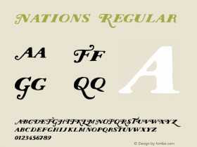
The best way to tick off a graphic designer cum typography blogger? Intercut the historical footage from 1963 in the BBC documentary Martin Luther King and the March on Washington with images of fake vintage banners printed in vinyl with friggin' Arial (released in 1982). Last night I was thoroughly enjoying the documentary until the sight of that godawful rip-off neo-grotesque specifically designed to compete with Helvetica – with its limpy leg on the R and half-arsed G – completely yanked me out of my viewing experience. I understand the need for poetic slow motion images of a banner waving in the wind, but couldn't they at least try to fake it a little more convincingly? Can you believe I actually felt cheated and only half believed the remainder of the documentary? I urge the United Nations to issue a stern warning and vote a resolution for mandatory typographic consultants in film and television productions, preferably the slightly brilliant and always affable Mark Simonson. Shame on you, BBC, shame on you!

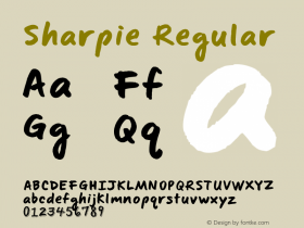
Genuine banner attached to a 1963 Greyhound bus, lovingly lettered with black sharpie.

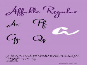
The fakest fakery in the fake history of fakeness, printed in vinyl with Arial.


-
 ShanhaiFonts
Brand:山海字库
Area:China

-
 Cangji Fonts
Brand: 仓迹字库
Area: China
-
 JT Foundry
Brand: 翰字铸造
Area: Taiwan, China

-
 Handmadefont
Brand:
Area: Estonia

-
·千图字体
-
 HyFont Studio
Brand: 新美字库
Area: China


- ·Moving Hands (Helena Hauff Remix) by The Klinik, official video
- ·10 Top Romantic Fonts on Valentine's Day!
- ·Once Upon DESIGN: New Routes for Arabian Heritage
- ·Japanese Typography Writing System
- ·XUID Arrays: One Less Thing To Worry About
- ·Amazon Releases Ember Bold Font for the Kindle
- ·Cher Got Sued For Font!
- ·Why Apple Abandoned the World's Most Beloved Typeface?
- ·"David Bowie is turning us all into voyeurs" button
- ·Ad for Hello Dummy! by Don Rickles