


EuroBasket Slovenia 2013


Source: http://www.eurobasket2013.org.License: All Rights Reserved.
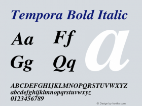
TheChaparral. Although Chaparral was designed by American type designer Carol Twombly and published by US-based Adobe, this choice feels very European to me, at least in the basketball context. A humanist slab in mixed case is not the most typical style for a sports event, is it?
Chaparral (1997) is named after the Californian shrubland with its small evergreen oaks. There is another contemporary slab serif with similarly casual details that carries a 'woody' name, too: FF Tisa (2008) by Mitja Miklavčič – Tisa is the Slovenian word for yew tree. Someone forgot to tell the EuroBasket designers that they could have used a fresh local typeface, instead of one that comes bundled with Adobe CS.

Source: http://www.eurobasket2013.org.License: All Rights Reserved.

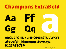
Source: http://www.championstore.eu.License: All Rights Reserved.

Source: http://www.aeropolis.si.License: All Rights Reserved.


-
 ShanhaiFonts
Brand:山海字库
Area:China

-
 Cangji Fonts
Brand: 仓迹字库
Area: China
-
 JT Foundry
Brand: 翰字铸造
Area: Taiwan, China

-
 Handmadefont
Brand:
Area: Estonia

-
·千图字体
-
 HyFont Studio
Brand: 新美字库
Area: China


- ·Quimbaya Coffee Roasters
- ·Make market-ready fonts with this 8 point checklist
- ·London Underground's iconic Johnston Sans typeface
- ·Food Not Bombs hypothetical redesign
- ·XUID Arrays: One Less Thing To Worry About
- ·Ad for Vincebus Eruptum by Blue Cheer
- ·Statement and Counter-Statement, Automatically Arranged Alphabets, and Arts/Rats/Star
- ·Antropofagia. Palimpsesto Selvagem
- ·Surabaya Beat by Beat Presser, Afterhours Books
- ·"David Bowie is turning us all into voyeurs" button