


eText Part Deux
Monotype recently announced a collection 'eText typefaces', designed to facilitate the best on-screen reading experience. These typefaces extend the palette of text choices available for Web and EPUB designers and developers. Our eText typefaces are part of the Monotype Portfolio for Digital Publishing, tailored for high-quality immersive reading on e-readers, tablets and other devices.

Our first update to the eText collection features four new families:
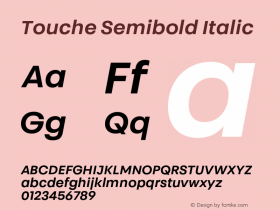
GeorgiaPro – The GeorgiaPro design includes 20 weights and styles (including light, black and condensed weights), making GeorgiaPro an ideal choice for rich typographic pages where performance and readability are key across a variety of screen resolutions and technologies. Georgia Pro also includes small caps and OpenType features for setting full-height figures in addition to the figures which range above and below the baseline (old style figures). The extensive character set covers Greek, Russian and Eastern European languages.
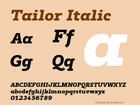
VerdanaPro – The Verdana typeface has been a standard in screen legibility for 18 years. This release continues to improve upon the performance and readability of the design across both screens and languages. With 20 weights added to the family, Verdana is now more versatile than ever. Light to black and condensed styles of Verdana will offer new capabilities for hierarchical typographic layouts. The extensive character set covers Greek, Russian and Eastern European languages.
Dante eText – Already shipping in some OEM reader products, the Dante eText family has brought old-world charm to immersive reading on screen. Originally designed by Giovanni Maerdersteig for fine book printing, Dante eText now brings the artistic touches of a great printer and book designer to the e-publisher's toolbox.
Linotype Didot eText – The world of high-fashion publications would not be complete without the high-contrast thick and thins of a Didot-styled typeface. Toshi Omagari revisited the classic Didot family to make it possible to use at screen sizes. The elegance of the original is not lost in the Linotype Didot eText design, which stands up to screen display, unlike many modern serif styles.


-
 ShanhaiFonts
Brand:山海字库
Area:China

-
 Cangji Fonts
Brand: 仓迹字库
Area: China
-
 JT Foundry
Brand: 翰字铸造
Area: Taiwan, China

-
 Handmadefont
Brand:
Area: Estonia

-
·千图字体
-
 HyFont Studio
Brand: 新美字库
Area: China


- ·Ad for Hello Dummy! by Don Rickles
- ·Make market-ready fonts with this 8 point checklist
- ·Cocoa Marsh Instant Fudge Candy Mix packaging
- ·Brother Moto Flat-Trackin' Tee
- ·Japanese Typography Writing System
- ·Surabaya Beat by Beat Presser, Afterhours Books
- ·47 free tattoo fonts for your body art
- ·The Great Comic Book Heroes, by Jules Feiffer
- ·20 Houses. A New Residential Landscape exhibition, Wallpaper* Architects Directory
- ·Quimbaya Coffee Roasters