


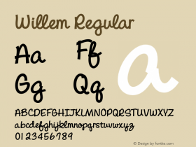
Inauguration Stamps for Willem-Alexander, King of the Netherlands


Source: http://www.pietgerardsontwerpers.nl.Piet Gerards Ontwerpers. License: All Rights Reserved.
"PostNL requested a typographic solution for this rather unique stamp. This put us in a dilemma. At that time, it was not yet known which name the heir would choose: Willem IV, Willem-Alexander or maybe something different. Further, no one knew the date on which the throne change would happen. We put our money on Willem-Alexander, but had an alternative up our sleeve, in case another name had been announced. The double name offered the opportunity to work with a monogram."
[The design features] a special effect that "only becomes visible when the stamps are placed next to each other […] Irregardless of the sequence, the monogram runs seamlessly from one stamp to the other."
For the type, two fonts by Dutch designers have been chosen: Quadraat Sans (1997) by Fred Smeijers for the text and Albertina Regular (1965) by Chris Brand for the monogram. "Quadraat Sans is an idiosyncratic sans-serif. We combined it with the classic serif typeface by Chris Brand. The lettershapes of Albertina are suggestive of the Dutch flag." — pietgerardsontwerpers.nl

Source: http://www.pietgerardsontwerpers.nl.Piet Gerards Ontwerpers. License: All Rights Reserved.


-
 ShanhaiFonts
Brand:山海字库
Area:China

-
 Cangji Fonts
Brand: 仓迹字库
Area: China
-
 JT Foundry
Brand: 翰字铸造
Area: Taiwan, China

-
 Handmadefont
Brand:
Area: Estonia

-
·千图字体
-
 HyFont Studio
Brand: 新美字库
Area: China


- ·Moving Hands (Helena Hauff Remix) by The Klinik, official video
- ·"Fantastic!" ad for Captain Fantastic & the Brown Dirt Cowboy by Elton John & Bernie Taupin
- ·Iconic Transport for London logo undergoes subtle redesign
- ·The Future of Sex poster
- ·Sinnesreize / Embracing Sensation by Silvia Gertsch and Xerxes Ach
- ·Surabaya Beat by Beat Presser, Afterhours Books
- ·Brother Moto Flat-Trackin' Tee
- ·"Die Alpen – Vielfalt in Europa" stamp
- ·Antropofagia. Palimpsesto Selvagem
- ·"David Bowie is turning us all into voyeurs" button