


Jeffery Keedy: Thoughts on Designing Type
The following article was written for FontShop by Jeffery Keedy.
In the early days of digital design I was frustrated by how few good typefaces were available in digital form. Also I realized that most typefaces were extremely out-of-date and did not express the spirit of our time. I felt it had become impossible to do new typography with old typefaces that were exhausted of meaning.
I believe it is essential to have new typefaces to do new and innovative typography. When the new digital technology made it possible to design and use your own typefaces, like many other designers, that is exactly what I did.
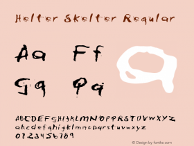
Only two of my typefaces are currently available to the public, Keedy Sans through Emigre, and Lushus through FUSE. My other fonts have been used in publications such as "Helter Skelter", "Morphosis: Buildings and Projects, 1989-1992", and Details magazine. I am currently working on a new typeface commission for Conde Nast. Eventually most of my typefaces will be available for retail from my type company Cipher.
In type design, I have never been very interested in pushing the limits of legibility for its own sake. Absolute clarity, or extreme distortion, is too simplistic a goal because it is ground that has already been well covered. I prefer to explore the complex possibilities that lie somewhere between and attempt to do something original, or at the very least, unique. I define "original" as any typeface design that presents the typographer with new possibilities. Even a revival of an old font can be an original re-interpretation that affords new possibilities.
However, new does not necessarily mean good. All typefaces start off as experimental, only a few become classics, while the vast majority exist somewhere in between. Today the word "experimental" is frequently used instead of the words "unfinished" or "underdeveloped".
When I am designing a typeface I try to work with at least two or three different ideas that are often in direct opposition to each other. If you can pull it off, it gives the typeface a more complex character and the typographer a greater range of expression to work with. It also makes it more challenging and fun for me. If I knew exactly what I was going to end up with I would never make it through the many tedious hours of fine tuning and refining.
My primary inspiration in type design mostly comes from other typefaces. It sounds good to say that you are inspired by great music, art, literature etc., but the fact is, type design is a very specific discipline and craft; if you are not well versed in it, you are unlikely to come up with a new idea or a design of much depth and complexity.
I am also inspired by type designers, their contribution as unique individuals, and how that manifests itself through their work. Designers like Dwiggins, Cooper, Goudy, Gill, Koch, Middleton, Excoffon, Novarese, Zapf, Carter, Unger, and Licko, would be on my short list. Then there would be a longer list of younger type designers and more obscure designers from the past. As an American type designer I have been particularly interested in exploring the American heritage and aesthetic.


-
 ShanhaiFonts
Brand:山海字库
Area:China

-
 Cangji Fonts
Brand: 仓迹字库
Area: China
-
 JT Foundry
Brand: 翰字铸造
Area: Taiwan, China

-
 Handmadefont
Brand:
Area: Estonia

-
·千图字体
-
 HyFont Studio
Brand: 新美字库
Area: China


- ·Barbe à papa Cotton Candy
- ·New York New York, Jazz St. Louis
- ·The Great Comic Book Heroes, by Jules Feiffer
- ·"Jesus Music" ad for Myrrh Records
- ·Troubadour poster, Opera Plovdiv
- ·Quimbaya Coffee Roasters
- ·Antropofagia. Palimpsesto Selvagem
- ·How to sell your typefaces
- ·XUID Arrays: One Less Thing To Worry About
- ·Sinnesreize / Embracing Sensation by Silvia Gertsch and Xerxes Ach