


The New Republic's New Logo


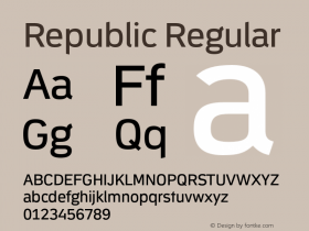
As a partner at Font Bureau, I welcome the use ofAntennaas the basis of the new logo of The New Republic. We haven't seen the magazine yet, but they sent out an e-mail with a sneak peek of the logo and a link to an offer for a free copy of the first redesigned issue.
Politico talked to Dirk Barnett, the Newsweek evacuee and new creative director of TNR. "We decided to break out of The New Republic's heritage and create something fresh and new," Barnett said.
He was referring to a long history of new logos with serifs, including one that I did back in the '90s in UBEC, Ultra Bodoni Extra Condensed. That one didn't last long.

The New Republic in 2000 with a logo designed by Roger Black. The illustration of Al Gore is by Mark Hess.
Perhaps the longest-running logo in the magazine's history was a superb flag in Zapf's Sistina, with startling black ears bleeding to the sides. Forgotten the name of the designer, but still love that spacing. (Note, the magazine was printed newsprint on off-white, uncoated book paper in those days—with Palatino text and headlines (then an unfamiliar typeface in the United States!)

The New Republic in 1967.

The New Republic's new logo compared with different settings of Antenna.
Speaking of spacing, that is one potential quibble (if you ignore the odd "New" and the chopped right side of the "C") an old typographer might have with this design. Note the way the "NE" smashed together. That just blurs together in small sizes. I ran up some alternatives in InDesign, starting with the spacing Cyrus Highsmith designed into the font.
Oh, well. When I retire, I will go around fixing letterspacing to my own preferences, and hacking into web sites to replace them, like Jeff Deck and Benjamin Herson who go around correcting typos on signs. In the meantime, I wish TNR the best. The magazine has been quickly improving since Chris Hughes (the Facebook founder who managed the social network campaign for Obama in '08) took over. Let's hope Barnett's logo has a long a run and builds a place in our hearts for Antenna like that '60s logo did for Sistena in mine.
Update:The New Republic's blog has more about the new logo in an interview with Creative Director Dick Barnett.


-
 ShanhaiFonts
Brand:山海字库
Area:China

-
 Cangji Fonts
Brand: 仓迹字库
Area: China
-
 JT Foundry
Brand: 翰字铸造
Area: Taiwan, China

-
 Handmadefont
Brand:
Area: Estonia

-
·千图字体
-
 HyFont Studio
Brand: 新美字库
Area: China


- ·Alibaba Supports Font Infringement Complaints
- ·Alphabet Stories by Hermann Zapf
- ·Troubadour poster, Opera Plovdiv
- ·Cocoa Marsh Instant Fudge Candy Mix packaging
- ·The Form Book by Borries Schwesinger
- ·Bevésett nevek (Carved Names), vol. 2
- ·"David Bowie is turning us all into voyeurs" button
- ·"Die Alpen – Vielfalt in Europa" stamp
- ·Ad for Hello Dummy! by Don Rickles
- ·Linotype Ad: "Linotype vs. Intertype"