


The Anatomy of Type: A Graphic Guide to 100 Typefaces

Obsessively organized into 17 group classifications, The Anatomy of Type explores 100 typefaces in loving detail, and contains enough information-from the quirky to the factual-to turn anyone into a font geek.
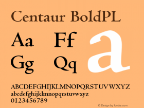
The full character set from each typeface is shown, and the best letters for identification are enlarged and annotated, revealing key features, anatomical details, and the finer, often-overlooked elements of type design.
Ever wonder how Claredon, Didot, and Centaur came to be? Or why Gil Sans proportionally resembles old-style serif faces, despite its inconsistent weight stress? Or who "pirated" the first font?
The Anatomy of Type provides answers to these questions, and so much more-it's a unique and highly practical work of witty reference for font spotters, designers, and everyday users.


-
 ShanhaiFonts
Brand:山海字库
Area:China

-
 Cangji Fonts
Brand: 仓迹字库
Area: China
-
 JT Foundry
Brand: 翰字铸造
Area: Taiwan, China

-
 Handmadefont
Brand:
Area: Estonia

-
·千图字体
-
 HyFont Studio
Brand: 新美字库
Area: China


- ·20 Houses. A New Residential Landscape exhibition, Wallpaper* Architects Directory
- ·Japanese Typography Writing System
- ·Type terms: the animated typographic cheat sheet
- ·The Form Book by Borries Schwesinger
- ·"Die Alpen – Vielfalt in Europa" stamp
- ·Statement and Counter-Statement, Automatically Arranged Alphabets, and Arts/Rats/Star
- ·He Invented a Font to Help People With Dyslexia Read
- ·Amazon Releases Ember Bold Font for the Kindle
- ·MC5 – Back in the USA album cover
- ·Cocoa Marsh Instant Fudge Candy Mix packaging